Dash Story
Back in 2019 I was pretty serious about running. I have had a coach for three years now and was doing a few ultras per year. I was also spending way too much time on Strava. Because I was being coached I started having ideas about generating running plans. The idea is that the plan would dynamically change according to your Strava activities. I left this idea marinate and in 2020 Apple released iOS widgets. I thought it would be the perfect time to start working on the app.
At this point I didn’t even have a name for the app. The idea had also morphed into tracking stats in the form of widgets. This would be my MVP. In the early days I settled with a few widgets - that still remain to this day.
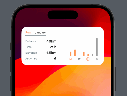
I called this “Small Basic”. And it just tracked a few things in a small form factor. I also had the same in the medium form factor. This was across week, month and year:
Back in the day, the only way to control the widget was via the app Settings:
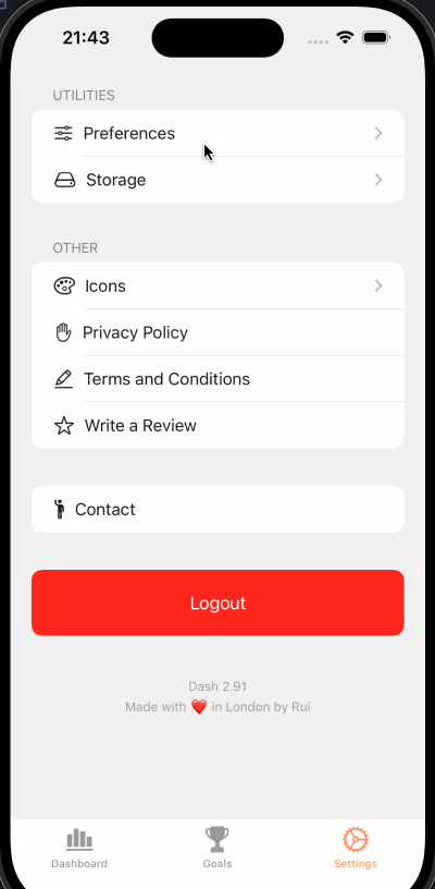
But with iOS 17, I moved all this logic inside the actual widgets. It was also feedback I received from a few users:
But to me this wasn’t enough.
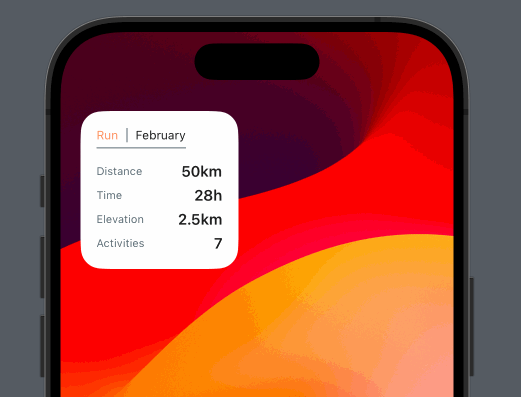
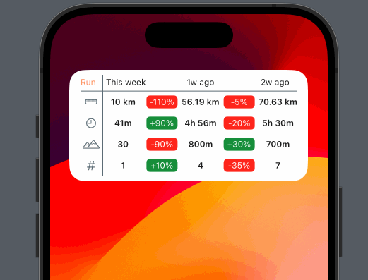
Something I did often, was compare my progress week-by-week. I spent countless hours sketching how I could display so much information across three weeks. Not only that, my interest was seeing by how much. So I want relative and absolute numbers. After many iterations I settled with this design:
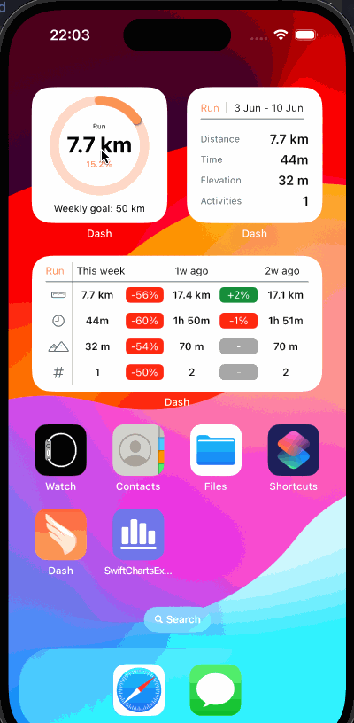
One can set the interval across week, month and year.
At this point I had everything I wanted. There were numerous lessons from working on this app. For example, that Dynamic fonts are a tricky affair, given how small the real-state is. I completely missed this and the UI was pretty broken. Now I know better:
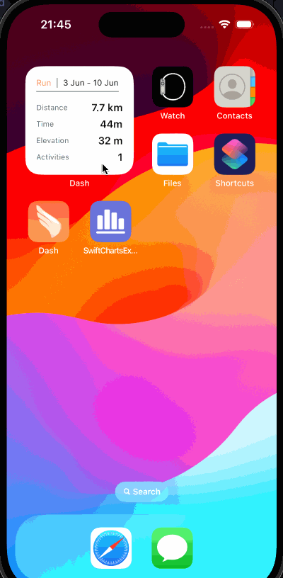
Back in the day, moving that slider would yield pretty bad results. For the time being it’s hardcoded, but I intended to make use of this. All the widgets are also Dark Mode compatible.
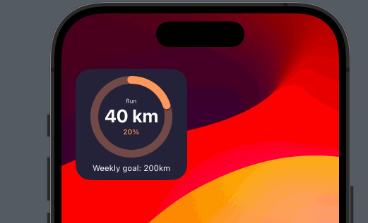
As time passed, I kept getting feedback that people wanted Goals. Goals, the feature, is an interesting situation. It’s something only available to Strava Plus users. There’s also no API available. This meant I had to allow users to create a goal in the app. That in itself is quite a lot of work. There would be custom UI, models and DB changes. I don’t shy away from a challenge, but my time is limited, so what can one do? I leveraged widgets settings:
The small factor for Goals was easy to design. I also added a bit of delight:
The medium factor turned out to be a bigger challenge. I did quite a bit of research on the matter and found a competitor:
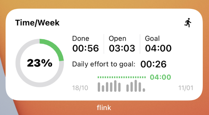
Flink has a nice UI. Aesthetically it’s quite pleasing. However some of the elements are irrelevant. Neither the graph line, nor the bars convey any meaningful information. It’s a general pet peeve I have with graphs. Most look nice, but they say little. The circular progress bar is not doing much either and occupies quite a lot of space. Because it’s so busy, on a widget, it’s difficult to see information. My goals with the widget then became: a) keep it simple and b) show the relevant information with a big font.
This was the outcome:
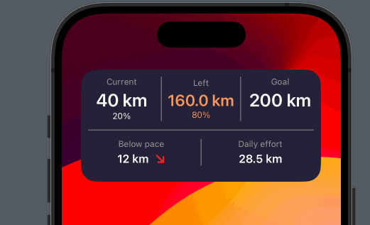
What I like the most in this widget is how the orange color moves. During an incomplete goal, the most important piece is what’s left. But once we are done with it, it stops being so.
Widgets are a challenging UI to work on. There’s limited space and one is tied in terms of animations. Notwithstanding it provides an interesting canvas to display data. I now see the limited space as an opportunity to do something that stand-out. After three years since I have released Dash I still use it every day. And that’s a win.